So here is week 29 Jul - 4 Aug, first spread...
On the Left :: Liam and his cars. I'm enjoying the Ali Word Art I picked up on special at Designer Digitals. They have weekly specials every Thursday :: Documenting a phonecall I had with my roomie from Varsity :: Documenting changing to salads for lunch :: A something I crocheted from yarn cut from an old T-shirt. It's for warm pots on the table :: A breakfast at Mugg & Bean with my friend Suzette. I added the "THU" sticker directly onto the sweet wrapper. :: The laptop my husband totally surprised me with for my birthday :: And two opportunities for one-on-one time with Liam this week...
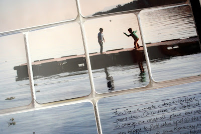
On the right I have the first of the photo's taken on our daytrip to Hartbeespoort Dam. Love the enlargement. I added the journaling direclty onto the photo, and some more Word Art from Ali. I also, in the top corner, added a "Sat" sticker, and a star cut from a journaling card. And that's the first spread.
The second spread is very photocentric, with little else added. I'm very happy with these photo's.
Favourite page to date...
More photo's from our trip to Harties.

And on the last page I had one more Harties photo :: A journal I received from all the ladies at camp, with something written in it by each one of them, really special :: A piece from the tissuepaper inside the giftbox containing my husband's gift to me :: A bit about our Sunday lunch routine :: Me & my husband taking an afternoon nap, or ending up giggling and taking cellphone pictures instead :: And a photo of Avon packaging. Enjoying their products, and love the reverse image of the "Hello Tomorrow".
I will be linking up at The Mom Creative again.


That big picture came out stunning! Also love the second from last page - it is so totally stunning. I also love how you put two landscape photos on a portrait small card with frames around. Did you make a template?
ReplyDeleteHi Cat, thanks! I do the two landscapes on portrait freehand in the Microsoft Photo Editing program. I think I'll do a post on how I do it.
DeleteOh my gosh gorgeous full page photo! Love how you added the journaling on top. Awesome look! I like how you photographed the salad from right above, very cool angle and looks great on your layout. The photocentric page is great, with lovely photos you don't need much embellishment. They speak for themselves.
ReplyDeleteI LOVE the enlargement. What a perfect photo for it. The vacation spreads look so wonderful.
ReplyDelete