Wednesday, 28 August 2013

Tutorial | Placing multiple photo's on a 4x6 with-out Photoshop.

In my last post I volunteered to post a tutorial on how I divide up a photo to cover an entire page. Then I had a question on how I do my two landscapes on a 4x3, and I thought I'd share this first as it would be easier to start here.

First you might want to know that you don't need Photoshop to do this. The program I use is Microsoft Photo Editing software. I got it for free years ago when I got Microsoft office. If you have Microsoft office, there's a chance that you'll have it on your computer.

Even though it is supposed to be a photo editing tool, I've taught myself how to use it to do all kinds of Digital Lay-outs with it. I also have Photoshop Elements, but I just keep going back to Microsoft for most of the stuff I do to my photo's, as I find it so user friendly.

I'm not an expert to help you find the program on your computer, but here is how I do my photo placement:

 
First you need to get into your "My Pictures" file. I go to Start (bottom left corner) and open "My Pictures". Apologies if I'm going too simple for any-one. Go into one of your picture files and select a photo. Prefebly one you don't like so much. (It will make sense just now).

Right click on the photo, select "Open with", then, if you have the program, select "Microsoft Digital Imaging.." Anyone still with me?

Found the Program? Yeah! Once you've opened your photo in Microsoft Editing, you go to the top bar and select "Effects". Scroll down to Transparency and select "Even".

Left clicking your mouse down, you now glide the transparency up to 100. Your photo will now be completely transparent. Click "Done".

You now have a transparent/blank 4x6 canvas to work on. (There are other ways to open a new page, I just prefer doing it this way as it is then automatically saved amongst my photo's & the right size I want.) 

 You are now going to open the photo's you want to work with. Go back to you photo file (bottom toolbar), and open the photo's of your choice following the same steps as when opening your first photo. I used 4 photo's.

Click on your transparent photo, and then, by holding down your mouse, drag each of your other photo's onto the blank one. The size can be adjusted by holding down the mouse and sliding it bigger or smaller.

You can adjust your photo's as you like. These will be cut up as two 4x3 cards, so allow a space in the middle for it to fit the pockets.

You can leave a border around it by making all the photo's smaller (bring in from the outer corners). Leave a double space on the inside for a border for each photo. I usually measure the printed photo on a journaling card and cut it to size. To save go to "File", and "Save as". Your photo is ready to be printed. Just upload with your other photo's and print as normal. You can then also use this as a template to do similar photo's. Just open up the original photo and drag other photo's on top. Once your photo's are in place, you can just click on the "template" and make it completely transparent to avoid any bits of the original showing up in your printed photo.

You can play around with two photo's on a 4x6 etc.
There is of course great templates out there if you do have Photoshop or PS Elements. I have some on my computer, but still end up going this route most of the time.This is just the system I like to use. Perhaps you want to give it try. Would love to hear if any-one succeeded.

Monday, 26 August 2013

Project Life | Week 31

Hello and welcome to Week 31. This is one of my favourite pages to date. Two actually, as I used two spreads to tell this story. One of the reasons why I'm so excited about this week is because I finally had a photo that I felt could work well as a full page enlargement. I'm hoping to in a next post share with anyone interested how I divided up my page with-out using photoshop.

 So here is week 29 Jul - 4 Aug, first spread...

On the Left :: Liam and his cars. I'm enjoying the Ali Word Art I picked up on special at Designer Digitals. They have weekly specials every Thursday :: Documenting a phonecall I had with my roomie from Varsity :: Documenting changing to salads for lunch :: A something I crocheted from yarn cut from an old T-shirt. It's for warm pots on the table :: A breakfast at Mugg & Bean with my friend Suzette. I added the "THU" sticker directly onto the sweet wrapper. :: The laptop my husband totally surprised me with for my birthday :: And two opportunities for one-on-one time with Liam this week...

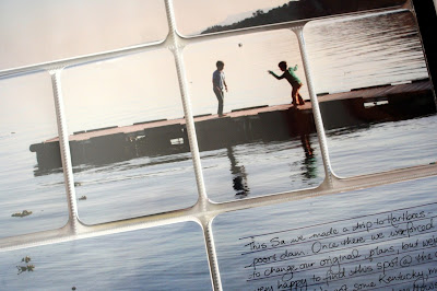
On the right I have the first of the photo's taken on our daytrip to Hartbeespoort Dam. Love the enlargement. I added the journaling direclty onto the photo, and some more Word Art from Ali. I also, in the top corner, added a  "Sat" sticker, and a star cut from a journaling card. And that's the first spread.

The second spread is very photocentric, with little else added. I'm very happy with these photo's.

Favourite page to date...

More photo's from our trip to Harties.

And on the last page I had one more Harties photo :: A journal I received from all the ladies at camp, with something written in it by each one of them, really special :: A piece from the tissuepaper inside the giftbox containing my husband's gift to me :: A bit about our Sunday lunch routine :: Me & my husband taking an afternoon nap, or ending up giggling and taking cellphone pictures instead :: And a photo of Avon packaging. Enjoying their products, and love the reverse image of the "Hello Tomorrow". 

I will be linking up at The Mom Creative again.

Tuesday, 20 August 2013

Project Life | Week 30


Hello and welcome to Week 30. A very special week for me, since it was the week of my Birthday. And I went on Women's Camp. It was actually my Birthday on Women's Camp... But first a look at the week:

With everything happening there's obviously lots of pictures (and hence an insert). I still don't feel like leaving out the everyday moments captured during a busy week to allow more space for the not-so-ordinary.

So life this week included :: Me and two friends getting together to handprint 50 dishcloths to go into the goodie bags for Women's Camp. We used an idea I saw on Pinterest and printed the circles with toiletpaper rolls. For the hearts I made a potato stamp. We enjoyed playing around with the design. :: In the middle section I added a clothing tag, a shopping list for camp, a kit card, and a bit of journaling about the week :: Then there's the everyday stuff- Liam playing on the trampoline :: And bathtime.

The right hand side has a Design A cut in half for Camp photo's (still need to add a little tag). We went to Pure Joy Guest Lodge just outside Pretoria, and had a really wonderful Bushveld stay. Great venue, great friends and awesome teaching by Liesl Mare. The Camp's theme was Freedom.

Insert turned over reveals more Camp photo's and a journaling page I made using Ali Edward's Long Journalers. I stapled the pages to stay inside the protector, instead of closing it up along the side (I cut down a big square page protector that came with my album). Bought the Journalers from Designer Digitals some time ago.

The other side of the journaling block has another Long Journaler with the story of my Birthday, which fell on the Sunday. Really a best of both worlds scenario, as I was made to feel so special by all the ladies' wishes, hugs, gifts and singing to me. The morning was spent listening to a profound testimony. And then at about 11-ish the Camp was over and my three men were there to pick me up. We went to Irene farm dairy for a buffet lunch. And then home to open my gifts. They saved theirs for last, and I loved how they managed to keep it a total surprise. Also loved hearing the boys over the phone while on Camp. The "So love this story" was a word-art freebie from Ali.


I'll be linking up at The Mom Creative again.   

Friday, 9 August 2013

Project Life | Week 29

Hello and welcome to week 29. This was Back to School week here.

But the main feature of the first page was not focused on that. It actually tells the story of me and a friend going on a pasta making course at a nearby coffeeshop. A lot of fun. And the pasta tasted great!
(Bonus was that I met another SA lady who was going to start doing PL. Sadly I didn't take her details.)
Like the previous week, I again struggled a bit to make the page work. I ended up cutting a date card from the kit paper as it was a more neutral option than the cards I had left. I think adding the block of red colour stragely calmed the busy page for me. It was a kit card to which I added a lined card cut to size.

I added the white page to separate the two lay-outs because this side is focused on one story. And I also loved including Liam's name practice, the "P's" all turned around.

On this side I included a photo from the first day of school for the new term. Then some of the 50 flowers I crocheted for an upcoming Women's camp. Quite a job, but I was amazed how I got into the swing of crocheting on a regular basis. Hoping to keep on crocheting on a regular basis now. (Btw. the pattern was found on Pinterest on my Crocheting board). A spontaneous photo of cars found in my bed (one of those "the kids were here" moments). Some photo's of a Baby Blessing I attended. The little darling was born prem at 33 weeks and 1.1kg, but with a lot of prayer doing great. I crocheted a little hat for her and couldn't believe it fitted.

And that's the whole page. The back insert has a skateboard picture by Liam in it. I enjoyed adding typed text directly onto the photo's this week. There are so many great free fonts out there. But I also added some dimension to the pages with some stick on labels (the "introduction" and "It happened" labels were old ones I had on hand.) The "yum" sticker was handwritten on a blank label that came with the page dividers. "Love you" was free word art from Katie Pertiet at Designer Digitals (she weekly gives away about 3 free items in her challenges). I re-coloured it red in Photoshop. 

As always, I'll link up at The Mom Creative on Thursday.

Thursday, 8 August 2013

The Week-end Lens :: Hartebeespoort Dam.


This past week-end we took a drive out to Hartbeespoort Dam. The initial idea was to visit a venue that was the film set for a movie set in the 50's, called Pretville. When we arrived there after our =/- 45 min drive we found that it was closed for a wedding. No mention on the website or even at the beginning of the dirt road there. Not cool.

So we decided to drive around the Hartbeespoort Dam, and discovered Schoeman's Oewer Club. We liked what we saw, and went to buy some KFC (as we didn't pack anything lunch.)


Being there we again realized what we missed moving from Durban to Jo'burg : We miss water, we miss birdlife, we miss lush vegetation, green. We even miss overcast days sometimes. We miss the outdoor life we used to know in KZN. Happy to find a bit of it here.


Of course, there's a lot of things we love about JHB, but that's another story. This day was about feeding that corner of our souls that loves the barefoot life.

And the sunflare moments... They really couldn't get enough of throwing rocks into the water. Dad's quite a pro, making them hop several times with each throw.

 We also got some wood and made a little fire especially to toast some Marshmallows.


(Word Art is from Ali, at Designer Digitals) We ate far too many of those.


Love the freedom they had here.


It was a great day, and a wonderful escape.

Tuesday, 6 August 2013

Project Life | Week 28b

Hello and welcome to the second spread for Week 28. As mentioned this was the week my husband turned 40, and we also had a trip to the zoo, so there was no way to do justice to the photo's in one spread.

On Saturday morning Theunis had a Men's Breakfast to Celebrate his Birthday. He's very unassuming and didn't want a big party, but really enjoyed the time with the men. The photo's was taken by one of the guests, Delmaine, who happens to be a professional photographer. So grateful for the great job he did.
I on the other hand, had a difficult time getting this page to work. It defnitely didn't help that the restuarant for some insane reason, decided to use pink on the table (something my husband never noticed, and apparently none of the other men either). I tried to tone it down with neutrals. I used a freebie Happy Birthday card, but ended up cutting it up and sticking the inner and outer circle onto some kit paper. I also added the file divider with kit paper stuck onto it to visually seperate the two pages. I used the outer circle of the freebie card on a grid card cut into a circle for a journaling patch. The grey card has a pull out card (I cut a little section out for the card to show) and it has some journaling about the day on it.

  The right hand page documents our first trip to Pretoria Zoo (on the same week-end). Zoo photo's can get pretty crazy busy, but I tried to still include enough space in the photo's. I love the bright pink wall there though. I just made the journaling card that says "Pta Zoo" and added some footprint fonts.
The first vertical card pulls out and opens up to tell about our trip and how we took the cable car, and loved the aquarium.

Some weeks you really have to work harder for the pages to get to a happy place. Still love this project.

I'm linking up at The Mom Creative, as always.